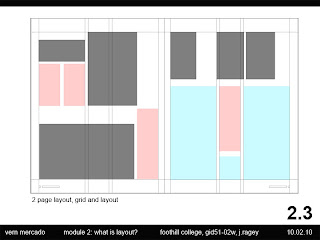
For our first assignment of the quarter, we were to analyze an existing magazine layout by finding it's overall grid and indicate through a diagram locations of copy (text) and images on the page.
Next, we were to sketch eight thumbnail options using the grids from the first part of the exercise if we were to design a two page spread for the same magazine.
Creative Brief
Dynamic Graphics Magazine targets the graphic design professional creating digital arts for print, web, and environmental design. The magazine layouts are visually pleasing with progressive designs following today’s latest layout styles and fonts. The articles are fresh and exciting encompassing articles that graphic designers must master in order to maintain a competitive advantage. It is a truly well designed magazine filled with dynamic images and inspirational art-related articles.
Colors: It is a full color magazine with dynamic colors as the magazine’s title implies. It also includes an interesting strip of red copy generally found in the vertical center of the page summarizing the article. This repeats throughout the entire magazine for visual interest.
Images: The images are generally photographs with a few illustrations showcasing illustrator’s work.
Mood: The magazine is trendy, playful, and edgy in order to keep the interest of the graphic design professional. Every page is a surprise yet keeps a strong sense of structure using its interesting grid layout.
Fonts: Fonts vary throughout the magazine from a serif font on the titles and body for ease of reading. San-serif fonts were selected for the “red” copy previously described. The selected fonts vary to reflect the article’s mood and information.
Magazine Layout (Grid): The magazine is divided into five equal vertical divisions maintaining the center portion (1/5 of the page) for text (to summarize key points in the article) for visual effect. This text is in a different font style and color from the rest making the images stand out from the page and a quick glance at the magazine possible. Since graphic design is optimal in a magazine like this, visual excitement is an important element.
A personal observation, the advertisement pages do not follow the same grid format making them stand out compared to the rest of the magazine's pages. Only the pages with the magazine articles follow this grid.
A personal observation, the advertisement pages do not follow the same grid format making them stand out compared to the rest of the magazine's pages. Only the pages with the magazine articles follow this grid.


No comments:
Post a Comment